Viewing entries in
Reviews

Beautiful Chocolate

Beautiful Chocolate

Beautiful Chocolate Bars by Anna Tolazzi

This weekend at the farmers' market Jaime and I bought some amazing chocolate from a local chocolatier, Anna Tolazzi. I was taken by how beautiful the wrappers were on each bar. The chocolate is made from high-quality fair-trade organic ingredients, and is made locally. I was excited by the wrappers while Jaime was excited by all the vegan options, and we ended up buying five different bars to try.

Beautiful Chocolate: Salted Caramel

####Salted Caramel#### This bar is my favourite, and not just because the wrapper is covered in random physics equations. The chocolate is not very sweet, but the caramel inside is homemade and balances the dark chocolate nicely. A few seconds after the first bite the salt kicks in.

Beautiful Chocolate: Passion fruit, mango, and coconut  semi-sweet chocolate

Passion fruit, mango, and coconut semi-sweet chocolate (Vegan)

Normally I only like chocolate this dark if it has a strong mint flavour. Here the passion fruit, mango, and coconut are very subtle, but the chocolate does not taste bitter. Very subtle and refined.

Beautiful Chocolate: Wild Blueberries and Earl Grey Tea

####Wild Blueberries and Earl Grey Tea (Vegan)#### I am a big Earl Grey tea fan. Watching Star Trek: TNG as a kid I was brainwashed by Captain Picard and his Earl Grey obsession. This is the first time I have had Earl Grey infused chocolate. The tea flavour was subtle and complemented the blueberries.

Beautiful Chocolate: Maple-glazed Walnuts & Sun-dried Lime

####Maple-glazed Walnuts & Sun-dried Lime (Vegan)#### My second favourite bar. I love nuts in chocolate. The maple-glazed walnuts make this bar crunchy, giving it some texture. The nuts overpower the lime at first, but after a few moments it shows up. It is easy to miss the lime though.

Beautiful Chocolate: Milk Chocolate Bar

####Milk Chocolate#### They ran out of the smaller bars so we had to buy the larger size. I much prefer milk chocolate over dark/semi-dark chocolate. Even though this milk chocolate is very good, I still prefer the salted caramel with the darker chocolate.

Beautiful Chocolate Bars by Anna Tolazzi

Anna Tolazzi Chocolates: Highly Recommended

Goodbye GoDaddy

I like to keep my domain name registrar and web host separate. For the last couple of years I have used GoDaddy as my registrar because they are cheap and any changes I make to my nameserver settings are quickly picked up. The downside with GoDaddy is that they are a sleaze bucket company. Putting aside the horrific user interface that makes me want to stab my eyes with flaming icicles, earlier this year their CEO killed an elephant for sport and now they support SOPA1. Enough is enough. I am joining the GoDaddy boycott on December 29th.

For anyone else who is thinking about transitioning away form GoDaddy here is a helpful guide. The only remaining problem I have is that I am not sure who to switch to. Ideally they will be cheap, have a decent user interface, and not be in cahoots with the Beelzebub daemon. Some poking around the internet has turned up Namecheap and Dynadot. Anyone have experience with either of these registrars? Any other recommendations?

Thanks!

Update: Looks like GoDaddy just reversed their SOPA support. Good start, but not enough for me to change my mind about leaving.


  1. SOPA is a bill being discussed in the US that would destroy the internet as we know it. Or as @sschillace puts it "Under SOPA, you could get 5 years for uploading a Michael Jackson song, one year more than the doctor who killed him.". 

Goodbye Scotiabank

Since Jaime and I have started using You Need a Budget, we have noticed how much we pay each month in bank fees. With Scotiabank we each have a personal account and a joint account plus Visa cards and lines of credit. Last month we spent over $60 in total bank fees. This is money the bank is charging us to leverage our money to make themselves more money. Fed up with this "double dipping" we have started to look for alternatives. The proverbial straw came tonight when we noticed a $50 service fee charged to one of our accounts. The account was formerly a student account, but has since switched over to a regular account (completely fair). The problem is that the bank did not inform us of this switch over. The response from the customer service agent was "You should periodically review your accounts for upcoming changes in the status of the account."

It is OK for Scotiabank to harass us with unwanted phone calls and junk mail trying get us to sign up for new services, but when it comes to informing us of important account changes that could involve hefty service fees the communications burden is too great. This horse must be in charge of Scotiabank's customer communications team.

After spending some time on the phone, Jaime managed to get the account type changed and the service fee reduced. The pile up of fees has left a bad taste though. We are definitely going to make the switch now. I have been a Scotiabank customer for thirty years continuously, but I don't think it is worth it anymore.

Any suggestions for better, more customer (and wallet) friendly banks would be greatly appreciated. Here is what we are looking for:

  1. No service fees of any kind. I should not have to pay a bank for the privilege of leveraging my money.

  2. Accessible ATMs.

  3. A good online banking interface that makes it easy to transfer and manage money.

  4. Some kind of physical presence so we have someone to talk to if need be.

  5. Simple account structure. ScotiaBank offers a byzantine labyrinth of account types for personal banking. There is the Scotia Moneyback, Scotia One, Basic Banking Plan, Powerchequing, Basic Banking, Scotia Power, Money Master, Scotia Daily Interest, Scotia Gain Plan, and many others. The only reason for such a complicated plan structure, most of which are only marginally different, is to confuse customers and charge more bank fees. This is a (profitable) mess that I expect most banks embrace. It would be refreshing to find one that aspired to more than this.

So far we are looking at PC Banking, and ING Direct. If anyone has experience with either of these or other banks post them in the comments below.

Thanks!

9 iPad Apps for Scientists and Students

9 iPad Apps for Scientists and Students

I have had a first generation iPad for nearly 18 months now and it has become my favourite computing device. Most of my web browsing and email consumption1 happens on the iPad instead of the computer. At conferences I see more-and-more physicists abandoning their laptops in favour of the iPad; it is so much lighter and portable than a laptop.

The iPad is a fantastic for reading PDF copies of academic papers (and scribbling notes on them too). I also use the iPad to take notes and work out equations. I no longer have to scan my notes and email them to myself, now they are all present in one spot.

After a year-and-a-half here are the apps that have stuck2.

Apps for reading

The iPad is an excellent device for reading (as long as you are not in direct sun light). It has been a long time since I have carried a book or stack of papers around with me. This is due in large part to the following three apps.

Papers

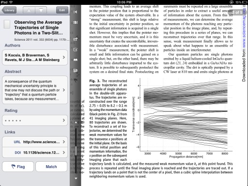
Papers is an app designed to house all of your academic papers. It includes an above average PDF reader and displays important meta data like the abstract, authors, and journal. Papers plays nice with other iPad apps too making it easy to fire over a PDF to any other app that supports PDFs on the iPad.

Where Papers shines is when it is paired with Papers for Mac. For years I downloaded PDFs into a hodge-podge collection of folders on my computer. It became so hard to find a PDF in the labyrinthine maze of folders that it was quicker to just download the paper again. Along came Papers and I have never looked back.

Papers strives to be the iTunes3 of your academic collection. Every paper I download immediately gets loaded into Papers. Searching and sorting papers is easy, and the built in PDF reader is optimized for journal pages. You can also search for and download new papers from within the app, but I prefer to use my web browser and the bookmarklet to automatically send a paper to Papers.

Papers for Mac also has bibliographic support (for things like Latex), but I find it to be more miss than hit. For that I maintain a separate Bibdesk database.

Papers for Mac can sync over WiFi with Papers for iPad, allowing me to take all of my papers with me. I rarely add a new paper to the iPad app. I find it too finicky and time consuming. But having constant access to every paper in my database is worth the price of admission.

If you use the desktop version of Papers then the iPad companion app is a no brainer. If you don't own a Mac or use Papers then I would give it a pass.
Papers Touch for iPad

Price: $14.99 CAD Developer: Mekenjost Download Papers

Good Reader

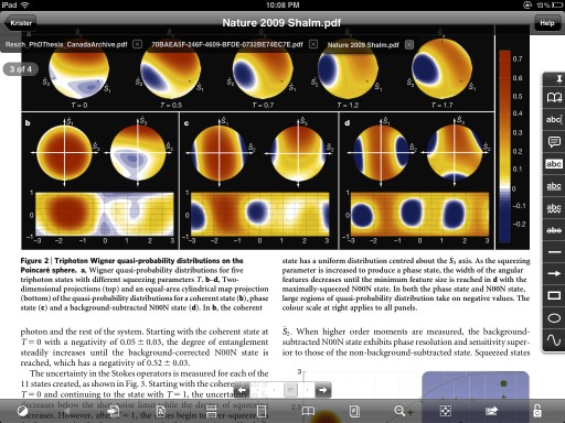
Good Reader is myy favourite PDF reading application. While Papers is great for academic publications, Good Reader is perfect for everything else. It is inexpensive, well maintained, and has excellent Dropbox and iCloud (amongst others) support. If anything, the program suffers from having too many options.

This should be one of the first apps you install on a new iPad.
Good Reader for iPad

Price: $4.99 CAD Developer: Good.iWare Ltd. Download Good Reader

Instapaper

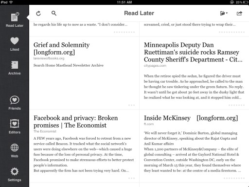
Often when I am browsing the web I come across an article I want to read, but not right at that moment. Instapaper offers a clever solution to the problem. By installing a bookmarklet in your bookmarks bar you can send any article to Instapaper to read later.

Instapaper strips out all of the ads and other crud typically found on other sites, leaving only beautifully formatted text. The reading experience beats the pants off of most other websites. Before Safari introduced its Reader function, I would send many of the articles I read to Instapaper just because the reading experience was so much better. A great deal of care has gone into this app and it shows.

Before a trip, I often load up Instapaper with articles to read. Longform.org is a great place to find interesting stories, and it integrates perfectly with Instapaper.

Marco Arment, the developer behind Instapaper, also maintains an excellent blog I recommend checking out.
Instapaper for iPad

Price: $4.99 CAD Developer: Marco Arment Download Instapaper

Kindle App

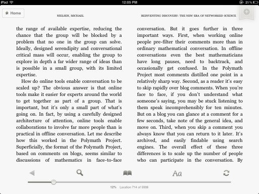
For reading eBooks on the iPad I recommend Amazon's Kindle app. The app synchronizes with all of your Amazon.com book purchases. Some typographic improvements could be made to the app, but overall it is a straight forward no-fills approach to reading. For the most part the app just gets out of your way so you can focus on reading.

I am currently using the Kindle app to read Michael Nielsen's new book Reinventing Discovery: The New Era of Networked Science, and it has been an enjoyable experience.

This is in stark contrast to Apple's bundled piece of e-reader crap, iBooks. I recently read Walter Isaaccson's tome Steve Jobs using iBooks. iBooks takes the metaphor of a real book too far. The page turning animations are cute for approximately three minutes. After that they become a distraction, breaking the immersion into the story. It is needless, distracting, and against Apple's typical "less is more" mantra. Even more unforgivable are the times when the app throws a seizure and randomly reflows a page causing you to lose your place. Unless Apple cleans this app up, I never intend on buying another book through their iBook store.

If you have your own eBooks (not through Amazon), then I recommend the app Stanza. It is a similar reading experience to the Amazon app (I actually prefer it), but it can be a bit clunky to synch new books to it.
Kindle for iPad

Price: Free Developer: Amazon Download the Kindle App

Apps for writing

These are apps designed primarily for text input through either the on-screen keyboard or an external bluetooth keyboard. My two requirements for any writing app are Drop Box synching and automatically saving the files in plain text format (.txt).

I am a heavy user of Notational Velocity,a simple note taking app, on my Mac. Before Notational Velocity I used to have dozens of different text files open, each acting as a reminder or temporary scratch pad. Notational Velocity excels at keeping notes, scribbles, thoughts, and drafts centralized and being able to quickly search for your text. Even with thousands of notes, the program returns search results nearly instantly.

Notational Velocity makes the entire workflow of note taking frictionless. Just start typing to begin a new note, and saving is done automatically, so you never have to worry about losing your work. I use Notational Velocity every day for everything from short reminders to longer form pieces like blog posts or letters. Because everything is stored as plain text it is trivial to transport and share your documents.

I have Notational Velocity set to store the text files in its database in a folder in my Drop Box account. I can then automatically synch these files with a writing program on my iPad. For an app to earn a place on my iPad it must be able to integrate with Notational Velocity.

Of the dozens of apps I have tried, two have stood out.

Simple Note

Simple Note is the closest implementation to Notational Velocity I have found for the iPad. It is a bare bones text editor that makes it painless to create new notes and automatically saves your work. The built in text search is fast, making it easy to find any note you have create. Simple Note uses a built in online service to integrate with Notational Velocity.

Simple Note has a neat trick up its sleeve: versioning. You can easily revert back to a previous version of any document with an easy to use control button. This is handy as the program automatically saves everything you do. If you make a bone-headed mistake and overwrite important information it is simple to undo the changes.

The combination of Simple Note and Notational Velocity works well to satisfy my text input needs. My only complaint is that the text from the notes could use some typographic help. The text is small and hard to read; this program is not suited for keeping presentation notes on.
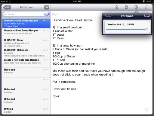
Simple Note with Versioning

Price: Free with Ads/ $4.99 with no ads Developer: Simperium Download Simple Note

Write Room

I began to look around to see if there is an app with better typography. My father was interested in using his iPad to read his sermons. Simple Note's type setting does not cut it. I decided to give Write Room a try.

Write Room beautifully formats text making it much easier to read. The app embraces a minimalist design that resonates with me. Write Room has the option of storing all of its notes in Drop Box folder. This allows me to automatically synch with Notational Velocity; I have set Notational Velocity to store and read its notes from the same directory. Now my copy of Notational Velocity and Write Room are always up to date.

The only downside with Write Room is that its search function is clunkier than Simple Note. Searching for files brings up a dialog box that makes it feel like an extra step is required. I can live with this minor inconvenience though, and Write Room has become my default writing app.
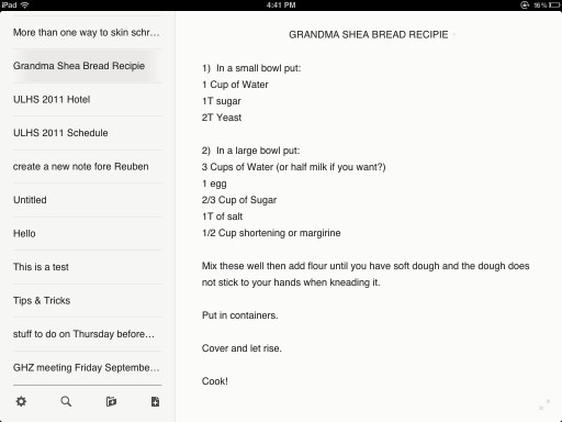
Write Room for iPad

Price: $4.99 Developer: Hogs Bay Software Download Write Room

Note Taking Apps

The iPad, with its touch screen, is a remarkably good hand writing and note-taking device. The iPad's screen has limitations; it is designed for input from fat fingers. Trying to write feels like finger painting. There are two ways to get around this limitation: using a stylus and clever apps.

Steve Jobs famously said "If you see a stylus they you blew it". I agree for most things, but I find a stylus much more precise for writing and drawing. Any cheap stylus will do. I picked mine up for $12.99 CAD at a local book store.

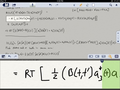
An entire breed of Apps has popped up that make it easy to take notes by hand. They do this by splitting the screen in to two sections. The upper portion of the screen is the document you are working in. The bottom screen contains a magnified few of a small region of document. This allows you to make nice, large and natural, strokes and have them automatically shrunk down to the size of normal hand writing. The best of these programs feature automatic stroke smoothing. The result is that my hand writing on the iPad is better than it is with a pen and paper. I even know of a couple of professors who write up all of their course notes on the iPad for this reason.

These apps are especially useful for working out equations. It is then a simple matter to email a PDF of the results to a student or colleague. I have tried a number of different note-taking apps (Muji Notebook, Noterize/Paper Port, Penultimate, Bamboo Paper, and Underscore Notify) but these are the three that have stood out for me. Each app does something I like, but right now I still have not found the perfect app for me.

Note Taker HD

Note Taker HD was one of the first apps to support the magnified zoom view for writing. It offers a number of different paper styles, above average stroke smoothing, and a plethora of options and settings (too many in my opinion). It does a good job and is currently rivalling Notability as my go to note taking app.

It feels clunky though. Options do not always "stick". The design is ugly. I don't understand why developers feel they must reinvent their user interface instead of using standard components from the developer kit. Very few people can pull this off, and Note Taker HD is not one of them.

Note Taker HD has also been updated to support text entry (via keyboard) as well. It does this by bringing up a side bar where you enter text. You type this text in the side bar and then it appears on the page off to the side. I wish you could just enter the text directly on the page. Fortunately I never use these apps for text entry, just handwriting. In fact, this is the only way I have ever seen anyone else at a conference use this app.

A big plus is that this app has a very active and responsive developer. Updates are constantly available, and there is a large community of users that has developed.
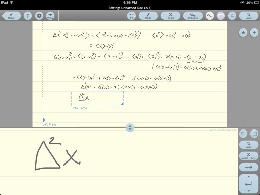
Note Taker HD

Price: $4.99 CAD Developer: Software Garden Download Note Taker HD

Notes Plus

When Notes Plus first came out just over a year ago I switched to it immediately from Note Taker HD. It looks better, has a better designed file system, allows audio recordings in a note, the drawing of shapes, plenty of options, and the split-screen

I find the shape function hokey and have turned it off. The audio recording option is nice, but I still have not used it for a serious purpose yet. It may come in handy one day though. The text insertion works well, but I do not need this feature.

The handwriting can sometimes become jagged and my documents have occasionally experienced minor visual glitches. The app also feels sluggish on my first generation iPad. I am not a fan of the faux leather used in the app though. After using this app extensively, I have now left it for a combination of Note Taker HD and Notability.
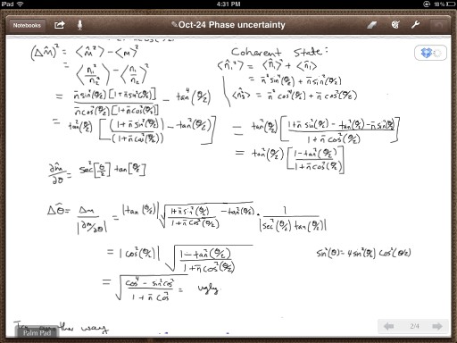
Notes Plus for iPad

Price: $4.99 CAD Developer: Viet Tran Download Notes Plus

Notability

Notability has recently shot to the top of the iTunes store download charts. It is cheap and had good reviews so I took the plunge. Notability fixes many of the complaints I have with Note Taker HD and Notes Plus, but introduces some irritating limitations.

The application takes a different approach to documents. Each page is designed to take in text input from a keyboard like a traditional writing app. There is an option to insert pictures or sketches. Choosing to insert a sketch brings up a second window with a number of drawing options. When the sketch is complete, it can be resized and placed anywhere in the document. Text that is being typed automatically flows around any inserted sketch or image. This is a nice option if you are interested in using the program this way.

For me, I am primarily interested in how it performs for capturing handwritten notes. Notability has the best implementation of the zoomed handwriting mode of the three. It has excellent stroke smoothing, is never laggy, and the auto-advancing is well done. I just wish it was possible to change the size of the magnified area. Right now it is quite small meaning the text you write is shrunk to a tiny size on the page. You can fit more on the page, but there is no way to write significantly bigger. UPDATE It has been pointed out in the comments that the size of the target box can be adjusted by using pinch-to-zoom on it. I have tested it and it works! This somewhat mitigates the following complaint.

A bigger problem is that the program does not allow you to pinch to zoom in on a portion of the page using the writing tool. Often I will want to include a sketch, plot, or diagram in my Notes. It is possible to draw directly on the document using the pen tool, but this leads to crude, giant, drawings like using a dry erase marker on piece of paper. The way Note Taker HD, Notes Plus, and just about every other drawing program out there gets around this is by allowing you to use the standard pinch-to-zoom gesture to magnify an area of the document and then begin your drawing. This allows you to make detailed sketches that, when you zoom back out, are appropriately scaled.

Bafflingly, Notability does not include this feature. Instead, you must use their sketch mode that opens a separate window. Even there pinch-to-zoom is not implemented. The result is frustrating and limiting. If you frequently need to sketch diagrams, consider going with Notetaker HD instead.

The other annoying thing about Notability is the lack of background choices. Specifically, there is no option for using a simple, white, background. The default background has a slight tint to it. There are a number of backgrounds available, but why this most basic one is not included is puzzling.

Notability is the best looking app out of the three. While it looks good, I wish more care had gone into thinking about usability issues. Instead of employing the standard convention with folders and files, the developers have implemented their own take on a file structure. The result is that it is frustrating and time consuming to do things like move a file from one folder to another (it took me a week before I realized this was even possible). There is a standard way to do this in iOS, but instead the developers have gone out of their way to reinvent a crappier wheel.

Despite these limitations, I am sticking with Notability for now. The zoomed handwriting is good enough that it is worth enduring the other hassles. Another nice thing about Notability is that it is easy to mark up PDFs. If I need to sign something or proof read a document, Notability has become my go to app.
Notability for iPad

Price: Currently on sale for $0.99 CAD Developer: Ginger Labs Download Notability

I am still disappointed with the note-taking apps out there. They are all lacking in some way. What is annoying is that if I could somehow make a Frankenstein app that merged only the good bits of each program it would be close to perfect for my needs. For now, I think either Notability or Note Taker HD have the best chance of overcoming their respective limitations. If a better app comes along I would not hesitate to switch.

Other

Drop Box

Drop Box is the glue that ties together many of the applications on the iPad. It acts as a file system in the cloud that allows files to be seamlessly shared amongst Macs, PCs and mobile devices.

Apple has recently released iCloud, their take on how cloud storage and synching should take place. It is very good at what it does (as long as you have bought into the entire Apple ecosystem), but for many uses Drop Box pants it. Drop Box has become such an integral part of my work flow that I have upgraded from their free account. There are other cloud services out there, but Drop Box has become as close to a standard as you can get.

Wrap Up

The iPad is becoming a versatile tool for scientific applications. It is by no means a laptop replacement, but there are certain things it can do far better than any laptop. Note taking and simple email and web browsing are some of those things. That is why I think iPads are becoming so common at conferences. It used to be that while giving a talk I would look out and see a sea of laptops open. More frequently these are replaced with less conspicuous iPads.

In the coming years I expect laptops to become rare and endangered species at conferences as tablets take over.


  1. Although I find typing anything longer than a couple of paragraphs a chore and revert back to my computer. 
  2. There are many useful applications that I do not cover in this review: VNC and screen sharing applications that allow you to control your computer remotely using the iPad, SSH and terminal clients, calculators and computational tools (a simple version of Octave, the Matlab clone, is available). I only use these type of apps occasionally, and instead decided to focus on the apps I use regularly. 
  3. Back before iTunes started to suck. 

Review of The Muppets

Review of The Muppets

The-Muppets.jpg

Wow. I hope the new muppet movie wins picture of the year. It is that good. In one of the final scenes in Pixar's 2007 film Ratatouille, the rat chef Remy serves a bowl of ratatouille, peasant food, to the feared food critic Anton "the Grim Eater" Ego. Ego sneers at the simple dish, but the first bite transports him back to his fondest childhood memories of his mother's cooking. Ego's cynical exterior cracks and he is filled with child-like joy and wonder for the first time in years.

The entire muppet movie for me is like Ego's first bite of ratatouille. I do not think a movie has ever made me so happy as I watched it. There were parts of it where I laughed so hard it brought literal, not metaphorical, tears to my eyes. I loved the muppets when I was younger and this movie played on that nostalgia perfectly.

The Plot

I went into the movie knowing next to nothing about the story. For the past week I have avoided all reviews and discussions about the film.

My first surprise is that it is a well executed and witty musical! I am a song and dance kind of guy and the muppets did not disappoint. The villain, Mr. Richman, has a hysterical and unexpected song, but the real showstopper is Am I a muppet or am I a Man? I won't spoil it, but I have never witnessed an audience united in such sustained laughter before. This number alone is worth the price of admission.

The plot line is standard fare for a muppet movie; the muppets are in danger of losing their theatre unless they raise an exorbitant sum of money. The only option is to reunite the cast and put on one last muppet show. Hijinks ensue. Yadayadayada.

The difference between this muppet movie and its predecessors is how well it is executed. As Ella Fitzgerald once sang "T'aint what you do, it's the way that you do it". The movie never takes itself too seriously, and never tries to be anything but the best, most authentic, muppet experience possible.

Jason Segel

In a movie full of A-list cameos Jason Segel shines. Puppeteering is a passion of his and his love for the craft comes through every scene. According to Jason1

It's impossible to be in a bad mood. Even when we shoot a 14- or 16-hour day no one in the crew gets angry. Kermit's there. You're not gonna be a jerk in front of Kermit. It's like being a jerk in front of your mom. You know that they won't approve. So, yeah, we've all been having a great time and now seeing the dailies there was a real sense that we were doing something special.

Conclusions

This is a great family movie. Leaving the theatre you will be filled with joy, happiness, and those irritatingly catchy lyrics from Manaman.

Verdict: Watch it. Multiple times if possible.

  1. From the November 2011 edition of the Cineplex Magazine, page 28. This is the magazine they hand out in the movie theatre to read before the film starts. I skipped the article on Twilight New Movie! and went straight to the Muppet movie article. 

Review of You Need a Budget 3

Review of You Need a Budget 3

Screen-Shot-2011-11-22-at-11.34.18-PM-e1322023703186.png

I recently came across a character study of John D. Rockefeller written more than a century ago by Ida Tarbell. At the time Rockefeller had amassed one of the largest personal fortunes in history by turning the Standard Oil company into a feared monopoly that patiently destroyed its competitors. Reading this piece I was struck by one of Rockefeller's early habits that led to his success–when he took his first job, as a clerk in a warehouse, he maintained a ledger book that tracked all of his expenses.

This document is his first account book, "Ledger A" he calls it. It is not too much to say that this book has been more conspicuous than the Bible itself in the religious instruction which John D. Rockefeller has given for years to Baptist Sunday-schools. This is not strange, for in Mr. Rockefeller's own judgment its brief entries explain his success...

And so "Ledger A" goes on with a painstaking record of every cent received and expended for a period of several years. Every cent earned could be accounted for, not a loose thread in his weaving, and one cannot help but feel that each particular penny was spent only after deliberation, and perhaps prayer.

Rockefeller knew at every moment where he stood financially. Every dollar was accounted for and given a job. He made sure that his money was always working for him to generate more money. This put Rockefeller in a position to take advantage of the business opportunities that eventually came his way.

A modern day Rockefeller ledger

Over the years I have developed poor financial habits. Being a student I have been used to living week-to-week without ever having a clear overview of my finances. Fortunately I never got into serious debt, but I have not been building my savings either. It has become clear that I need to take control of my finances and start budgeting.

I considered a number of different options. One of the simplest is the envelope budget: put your money in a number of different envelopes each labeled with a particular budget category, like groceries, rent, utilities, and so on, and then only spend the money in that envelope. I know people who replicate the budget envelope system using a spread sheet. For a while I considered using a spread sheet, but this was too cumbersome for me. I would get lazy and stop using it.

What I want is a program that is easy to keep up to date and has accountability built in. I looked at Mint.com, Quicken for Mac, MoneyWell, and iBank.

Mint makes it easy to keep track of your transactions; because Mint scrapes your account1, it automates most of the entry tasks. There is very little in the way of budget options or accountability though. Mint lets you know what you are spending your money on, but this does not lead to a change in habits alone. I have tried similar systems in the past, but have failed. Knowing that my account data is being automatically downloaded and categorized provides a sense of accomplishment, but it does not stop me from overspending. There is no planning built in.

Quicken for Mac is a disaster, and iBank works like a more sophisticated version of Mint. MoneyWell provides some budgeting options, but again there is very little in the way of accountability. What I wanted was a modern day version of Rockefeller's ledger: something that would allow me to easily enter my expenses, track my spending, and stick to a budget. A software program that would help me get my money working for me.

You Need a Budget (YNAB) is the closest thing in spirit and execution to Rockefeller's ledger that I have found. The program operates around four principles:

  • Give every dollar a job.
  • Save for a rainy day.
  • Roll with the punches.
  • stop living paycheck to paycheck.

The most important principle I have found is to give every dollar a job. When money comes in you manually assign it to a task. For example, our food budget is $400 per month. $400 of my salary each month is tasked with feeding my wife and I. This is simple, but it brings in accountability. At the beginning of each month you know exactly where each dollar will be spent.

There is flexibility in the system too. If you overspend in one category you must take it from some place else. This could be another category with extra money left over or from your savings. YNAB allows you to download your account files from your online banking site, but I don't recommend doing this. The system works best when you manually enter in your transactions at the end of each day. It takes a couple of minutes longer, but keeps you accountable by forcing you to reconcile and review your budget.

A blank budget file for YNAB 3

YNAB does have a steep learning curve, but also excellent online support. There are numerous videos that walk you through the program step-by-step. They also offer teleseminars and have an active forum. I strongly recommend following the tutorials when setting the program up; if you try to wing it you will most likely end up frustrated. I made this mistake when starting. The first thing I did was to import several months worth of transactions into the program and then categorize them. YNAB prefers that you start with a clean slate. You import your starting balances (any debt is categorized as "pre YNAB debt") and then assign the money you have available to your various budget categories.

My wife and I use Dropbox to sync our budget file between our computers. This makes it easy for us to update and keep our budget current. To keep the budget file from becoming corrupted we have to make sure that only one of us is working on the file at a time. I wish YNAB would build in better Dropbox support to automatically resolve conflicts, and also support other services like iCloud.

YNAB also offers an iPhone companion app that syncs with the program over a local wifi connection. Syncing is fast, but it would be nice if the app was able to automatically sync using Dropbox or iCloud so that the program is always up to date. I also wish that the software was available through the Mac app store, but the licensing terms are quite generous (only one license is needed per family).

YNAB does not allow you to track and manage your stock and investment portfolio or provide options to prepare your tax returns. it also does not provide traditional double entry account management either. YNAB is designed entirely around budgeting, and it does this exceptionally well. If you are not interested in or have no need for budgeting, you are better served by another program like iBank

My wife and i have been using YNAB for two months now and the results have been amazing. Our expenses have dropped dramatically–YNAB saved us over $350 in the first month alone, paying for itself several times over. Two months in and we have paid off the rest of our residual debts and now have some savings. For the first time in my life I feel in control of my finances. The principles are simple, but YNAB provides the structure and support to help put them into practice.

YNAB is one of the few pieces of software that I can say has changed my life. Now the discipline and effectiveness that led to Rockefeller's early success is available to anyone.

Software: You Need a Budget
Price: $60
Available for Mac and PC.
Strongly recommended


  1. In Canada there is a chance that using Mint.com will lead to a bank denying you fraud protection (via Money Sense).  UPDATE: @mexicanuck asked @RBC if this is true. @RBC confirmed it with this tweet. RBC confirms they do not offer fraud protection for aggregator services like Mint

Light Craft Workshop Fader ND Mark II Review [Updated]

Light Craft Workshop Fader ND Mark II Review [Updated]

Close-up-of-Fader.jpg

I recently bought a Light Craft Workshop Fader ND Mark II variable ND filter to use for shooting videos, and was curious about how well it performs. I used the Fader ND to film the water fight that broke out near my house last week, and was pleased with the results (Vimeo version embedded after the jump). But to be more thorough I decided to conduct a series of tests of the Fader ND. In short, the optical quality of the filter is very good with little degradation of the image. The filter is also neutral throughout its useable range of attenuation introducing almost no colour shift. I strongly recommend it to those looking for a budget variable ND filter. Read on for my full review of the Fader ND Mark II.

[Update] I have added some resolution tests of the Fader ND at longer focal lengths at the end of the post.


Introduction

Shooting video in daylight is challenging; it is often so bright out that a high shutter speed on the camera is required. This can lead to jerky and unnatural motion in moving subject, and force the use of high apertures. A solution is to use a neutral density (ND) filter in front of the lens. An ND filter blocks out some of the incoming light allowing a slower shutter speed to be used. Good ND filters attenuate every colour equally (hence the term neutral) while bad ND filters can introduce an unwanted colour cast.

The two main solutions are to use stack of fixed ND filters to control the light level or to use a single variable ND filter whose strength can be adjusted. For my purposes, I decided to go with a variable ND filter. Most variable ND filters are made up of two polarizers that can be rotated with respect to one another. Light travels through space as a wave, and its electric field oscillates back and forth similarly to how a water waves undulates up and down. While water waves can only move up and down, light can oscillated in all directions (for example, side to side, up and down, diagonally, and even in a helical spiral). The direction that light oscillates is known as its polarization.

A single polarizers will cut out 50% (1 stop) of the light from an unpolarized light source like a light bulb. After passing through the polarizer, the light has a definite polarization. If a second polarizer, aligned with the first, is inserted next then all of the polarized light will pass through. If instead the second polarizer is rotated by 90 degrees all of the polarized light is blocked. By rotating the second polarizer in between 0 degrees and 90 degrees the amount of light passing through can be controlled.

The problem with using polarizers to create a variable ND filter is that the polarizers are not always of a high quality. There can be a serious loss of resolution if the optical quality of the polarizer is not good. Poorly manufactured polarizers, with extra materials between them, can also lead to a variable colour cast being introduced into the image–as the polarizers are rotated the colour cast changes.

There are several options on the market for variable ND filters. The deluxe higher end models are the Singh-Ray variable ND filters that can cost several hundred dollars. There is also a newer product out by a company called Light Craft Workshop that makes significantly cheaper (under $100) variable ND filters. I also came across these filters on eBay sold by Rainbowimaging that are incredibly cheap (around $30). I have ordered a number of things from Rainbowimaging before, and have been pleased with the quality and service received. Because they are so cheap, I nearly bought one of these filters just to try out. I had a hard time finding any reviews on them, but did stumble upon some Youtube videos that made it look like these filters introduced a significant colour cast. It was hard to tell if this is the case, but I decided not to risk it. Perhaps one day I'll order one and do a test.

In the end, I went for the Light Craft Workshop Fader ND Mark II (second generation version of the filter). Philip Bloom, a well known blogger and film maker, has good things to say about the Fader ND, so I ordered a 52mm filter from the Canadian distributor on eBay. Again service was excellent and shipping fast. While the filter I ordered will thread onto a 52mm front element, the polarizers are 55mm. This is to help limit vignetting, but means that any other filters/lens hoods that go on in front must have a larger thread size. Every size of the Fader ND uses polarizers that are one step larger.

The Fader ND comes with a convenient carrying case as well as a lens cover (55mm in my case) that works well. The polarizers rotate smoothly and are well constructed. There are marks on the filter to help serve as a rough guide, but in practice I have not found them useful. They do not correspond to the number of stops of light blocked. This is not a fault of the Fader ND, but is a consequence of the way polarizers work. As the angle of the second polarizer changes, the amount of attenuation will not vary linearly. If the Fader ND were to introduce marks that correspond exactly to the number of stops of light blocked, the marks would be distributed in a more complicated fashion. It would be nice to have accurate markings, but for the price I can not complain.

To test the resolution and check for the presence of a colour cast, I carried out two different tests. In the first, I set up a tripod outdoors and shot a sequence of photos of a picture from the book "A New Kind of Science" by Stephen Wolfram. I do not have an Airforce test chart, but this book has very high resolution photos that contain fine patterns suitable for the test I am interested in. I am not able to calculate the resolving power of the lens with and without the Fader ND, but any major loss in resolution should be readily apparent.

Resolution Test

Light Craft Workshop Fader ND Mark II test image

The resolution test was conducted on my Panasonic GH1 using the Panasonic 20 mm f1.7 pancake lens. In all the photos the aperture is fixed to f 5.0. First a picture was taken without the Fader ND to serve as a reference. The Fader ND was then screwed into place and a sequence of pictures taken with different attenuation settings. Each picture was taken with the Fader ND set to attenuate one extra stop with respect to the previous photo. The exposure was set by first halving the shutter speed and then adjusting the Fader ND until the correct exposure was reached (as I had to rely on the metering in the camera, the exposures are close, but not perfect).

When the Fader ND is set to 0 degrees there is a loss of 2 stops of light (maximum transmission). This matches Light Craft Workshop's claim of 2 stops of attenuation. Each subsequent picture represents an extra stop of attenuation. The central portion of the image is shown at 100% crop to provide an idea of the resolution with and without the Fader ND.

Resolution Test Light Craft Workshop Fader ND II

I am surprised at how well the Fader ND performs; there is barely any discernible degradation in the resolution of the image. The Fader ND also performs well over a large attenuation range (meaning any degradation in resolution is due solely to the quality of the polarizers and not the rotation of them). I get over 11 useable stops of attenuation which is more than Light Craft Workshop specs the filter for. Setting the polarizer close to 90 degrees (most of the light blocked) leads to appearance of a "cross" pattern that is typical for these types of filters.

Light Craft Workshop Fader ND Mark II Polarization Cross

Colour Cast Test

To test for the presence of a colour cast, I shot a series of pictures of white sheet of paper. Without the Fader ND present I manually set the white balance of the camera. This is the white balance setting used in all shots. Next the Fader ND was screwed on and pictures of the paper taken for different settings of the Fader ND. Again, the exposure was compensated for by adjusting the shutter speed and ISO. These photos were taken in the passengers seat of a moving car, so they are blurry at lower shutter speeds. I also had some problems keeping the lighting/exposure as consistent as I would have liked, but they are still instructive. The camera settings along with the RGB values for the white in the image are shown (the images were underexposed, but that does not change the results of the test).

Light Craft Workshop Fader ND Mark II Colour Cast Test

Again, the performance is excellent. From 2 to 10 stops there is a slight but consistent colour cast as blue suffers a higher attenuation. After 10 stops a small bluish tint appears. In both cases the colour cast is minor and can be easily corrected by white balancing the camera with the Fader ND on. What is most impressive is how neutral the Fader ND is as the attenuation is changed. Cheaper crossed polarizers are notorious for introducing dramatic bluish, greenish, and reddish colour shifts as the polarizers are rotated. This is not the case with the Fader ND Mark II.

Resolution Test at Longer Focal Lengths

There has been reports that the Fader Mark II performs poorly at longer focal lengths. To see if this is the case, I repeated the resolution test using my Panasonic 45-200mm zoom lens. I placed the camera on a tripod and set the aperture to F8 and the shutter speed to 1/320 of a second. First I tested the camera with out the Fader ND (ISO set to 100) taking photos at six different focal lengths. Next I screwed on the Fader ND and repeated the test. To compensate for the two stops in lost light I upped the ISO to 400. The results can be seen below.

Resolution test of the Light Craft Workshop Fader ND Mark II at longer focal lengths

There is a clear loss of resolution as longer focal lengths are used. There also seems to be a loss of image contrast as well. By the time 200mm is reached, the image is noticeably blurred. Shorter focal lengths are not nearly as bad. I definitely would not use the Fader ND on a longer reach zoom lens for photography purposes. For video it is probably fine where the high resolution image out of the sensor is down sampled. The significant drop in resolution is likely due to the optical quality of the polarizers used. Any roughness or tilt in the surface of the glass can lead to this decrease in quality. I have heard reports that the much more expensive Singh Ray filters as well as the Fader ND HD do not suffer this loss of resolution at longer focal lengths. Buying two high quality linear polarizers (or a linear polarizer and a reversed circular polarizer) and building your own variable filter may be another way to avoid these problems.

Conclusions

The Fader ND provides excellent value for the money. There is not a noticeable degradation in image quality at shorter focal lengths and the filter is neutral from 2-10 stops. My only regret is not buying a larger filter. Right now my largest lens has a front filter size of 52mm, so the Fader ND works on all of them. In the future if I buy lenses with a larger front filter I will have to purchase a larger Fader ND. If I had bought a larger Fader ND from the start I would have "future proofed" myself. Given the quality and value of the Fader ND Mark II, I will have no qualms buying a second one when the time comes. If, however, you are looking for a variable filter to use with long reach zoom lenses for photography, you are better off looking for another solution.

Review of Final Cut Pro X(press)

Review of Final Cut Pro X(press)

Final Cut Pro X

Apple recently released a new version of their popular movie editing software package Final Cut Pro X. As a former Final Cut Express user (and sometimes Final Cut Pro user), I love Final Cut Pro X. I don't have a tape based work flow. I shoot with a DSLR. I work by myself. I am not an expert or professional—I just love to tell stories. After taking a couple of days to get used to the new layout, I find the changes really let me fly. Everything is so much faster now without having to wait for things to render. With the new version the software mostly stays out of my way, leaving me time to craft a story. It has made making movies fun again. This is a definite step up compared to the (now discontinued) Final Cut Express.

The Final Cut Express Prespective

People using Final Cut Express and iMovie will find a lot here to like. The new interface is much simpler to use. This is a solid foundation on which Apple can build on in the future. Much of the power has been harnessed in a way that allows complex things to be easily accomplished. For the most part I like the magnetic timeline; it makes simple cuts quick to achieve. The new trim tool is also cleverly done. Audio managmenent within the program is also much better. I like that the magnetic timeline can be switched off to restore an older style workflow if needed (just select the P icon for place). The new audio sync is also handy. I used to do all of my audio syncing by hand using a clap or some other sharp noise. It wasn't that difficult to do, but it does take some time. Now it is almost instantaneous.

Final Cut Pro X screen shot

Working with the AVCHD files from my Panasonic GH1 (hacked) is also much easier. There is no need to transcode the files (although more background rendering seems to be needed). I can still skim and edit the native footage without slowdowns. Even better, while the footage is being imported and I can work directly with the files on my memory card. Adding text also seems much simpler and less cumbersome than with the old Final Cut (notwithstanding Conan's video editor's experience). This is a tool that is so much faster and easier to work with.

There are some frustrating things I have encountered. Some of the transitions and text effects are buggy and don't always render correctly. There are occasional crashes. The documentation is spartan at best. It took me hours to figure out that you cannot use an external time machine volume to store events. Luckily I had another drive around to use as a kind of scratch disk. I am also trying to figure out the best way to edit a much more complicated music video without having the audio constantly fall out of sync. I am not sure the older Final Cut would offer much advantage here though (the nature of the project precludes the use of multicam). I also wish the colour correction tool offered s-curves like those found Aperture. I find the current tool to be imprecise and clunky compared to colour correcting in Aperture or Lightroom, but It is still a vast improvement on what Final Cut Express offered.

The Professional Backlash

This product has been been met with widespread derision from film professionals and experts. Film pros have legitimate reasons to be upset; the new software is missing many critical features essential to a professional environment (these missing features and problems are well documented here, here, here, and in the comment section of David Pogue's follow up review). It should be noted that Apple has promised to add many of these features back in over time. In the meantime, Apple is issuing refunds to unhappy customers (via EOSHD).

Apple has also discontinued the old, much loved, version of the software that form a critical piece of the workflow for many organizations. This is the move that I think is most worrisome for these organizations; they can no longer go out and buy new copies of the program for updated workstations. There is no supported way forward for their workflows as a stopgap until Final Cut Pro X is feature complete. If Apple cares about the professional market (a big assumption), they could create a lot of good will by selling copies of Final Cut 7 price matched to the current version of Final Cut Pro X (a price drop from $1000 to $300) until Final Cut Pro X is up to speed.

Some of the reaction around Final Cut Pro X has bordered on hysteria though. People complaining about starting a project in an older version of Final Cut Pro and not being able to finish it in the new program are anything but professionals. A professional does not switch editing suites and make drastic changes to their workflow just because a newer, shiner, product comes out. Don't switch horses midstream. This advice is as true today as it was in Lincoln's time.

The Future

Apple's tagline for Final Cut Pro X is "Everything just changed in post". This is certainly true for me. Final Cut Pro X feels more powerful and accessible to me than FCP7 or FC Express ever did to me even though it is missing key high end features. This is a key theme of all of Apple's products—first make the features that are used 90% of the time as simple and intuitive as possible, then add in the extra functionality over time. This drives power users nuts, but makes things infinitely more useable for the rest of us. Too many companies waste their time on the 10% of features that only a small fraction of their potential users care about.

Apple did this with iMovie 08 when they released a stripped down and simplified video editor that replaced the much loved iMovie 06. Power users hated the new version (rightfully so) as many of the features they had come to depend on were stripped away. But iMovie 08 opened up video editing too many more people (including myself). It coincided with the popularization of the Flip class of cameras that made shooting video cheap and simple (my first camera was a Flip Mino HD). iMovie 08 made it simple and fun to cut together footage, add basic effects and text, and produce decent looking video clips to share online. Most new people using iMovie 08 didn't care about tape ingest, multiple track, and the extensive plugin support of iMoive 06. They just wanted to share videos on Youtube. I remember the thrill when my Flip arrived in December 2008. I shot a few clips of Jaime walking through a blizzard to a restaurant to pick up some take out. Within an hour I had finished editing a short montage set to music. Despite its roughness it is still one of my favourite movies. The much steeper learning curve of iMovie 06 would have never let me do this.

I love this quote from Daringfireball's John Gruber about the iPad:

The central conceit of the iPad is that it’s a portable computer that does less — and because it does less, what it does do, it does better, more simply, and more elegantly.

I remember handing my iPad to my parents for the first time. It was the first computer they were not scared of. Within minutes they were surfing the web and watching videos on Youtube. When I came back twenty minutes later and my mom had found Sketchbook Pro and made a little drawing. The iPad doesn't have nearly as many features as their regular computer, but it is so much simpler to use that they end up doing far more with it. Now that my parents have iPhones they use them far more than their computers despite the smaller screens and touch keyboards. This is something most power users don't understand. It isn't about features and checkboxes. It is about usability for the most people.

Just as the flip cameras revolutionized the low end of the video market, DSLRs are changing the high end. Most big budget movies won't be shot exclusively on DSLRs (yet), but many smaller features, commercials, and indie films are. Final Cut Pro X is for these people and what Apple sees the future of film making to be. Skate to where the puck will be, not where it is.

Ron Brinkmann, one of the developers who worked on Apple's now discontinued high end movie software Shake, has this to say about Apple and its support of professionals:

So if you’re really a professional you shouldn’t want to be reliant on software from a company like Apple. Because your heart will be broken. Because they’re not reliant on you. Use Apple’s tools to take you as far as they can – they’re an incredible bargain in terms of price-performance. But once you’re ready to move up to the next level, find yourself a software provider whose life-blood flows only as long as they keep their professional customers happy.

Serentity Caldwell writing for Macworld says this:

When it comes down to it, Final Cut Pro X isn’t about alienating professionals: It’s about finding out just what a “professional” looks like in this day and age. That line has blurred tremendously in the last decade thanks to widely-available—and inexpensive!—personal technology. Filmmakers are putting together features for $11,000. TV crews have gone digital; and that’s not even covering the amount of video created every day on the Web.

Apple doesn't care about the high end entrenched professionals, they care about the rest of us.

UPDATE: Apple has released this FAQ about missing features and a rough timeline for when things will be included. Looks like Multicam support will be in the next major update.